
Consistent use of fonts is important for brands. So, what are the best practices for typography pages in brand guidelines?
Logos, colors, and typography are on the top of the list when professionals talk about brand identity. The design of logos and the choice of colors get a lot of attention, but we rarely talk about fonts, but they are an equally important part of the mix. If the goal a consistent experience for customers, then consistent use of fonts in paramount.
What are typography pages in brand guidelines? Typography in brand guidelines specifies the fonts that designers can use when designing for the brand. They spec out the size, spacing, capitalization, and proper usage of type. Typography specs keep a brand’s fonts consistent.
In this article, we look at the style guides of these brands as examples of typography in brand guidelines:
- Royal Caribbean
- Alienware
- Uber
- Moen
- WRC: World Rally Championship
- The North Face
- Mopar
- Cisco
- Virgin America
- Waves To Wilderness
- Alfa Romeo
- Walmart
- Medium
- United Way
- Dow Chemical Company
- Baboon
- UC Berkley
These are large brands with many contributors and partners to organize. No matter the scale of the organization you are working with, these examples will give you a better sense of how to best standardize your brand fonts. I make typography pages for all brands I design; it just helps keep things straight and consistent – even if my colleagues and I are the only ones referencing it.
Examples of typography pages in brand guidelines.
Royal Caribbean
This brand of cruise liners is all about family fun, but they do not mess around with fonts. Royal Carribean uses Kapra Light, and Darwin bold, regular and light. You can browse The Royal Carribean brand guidelines here.

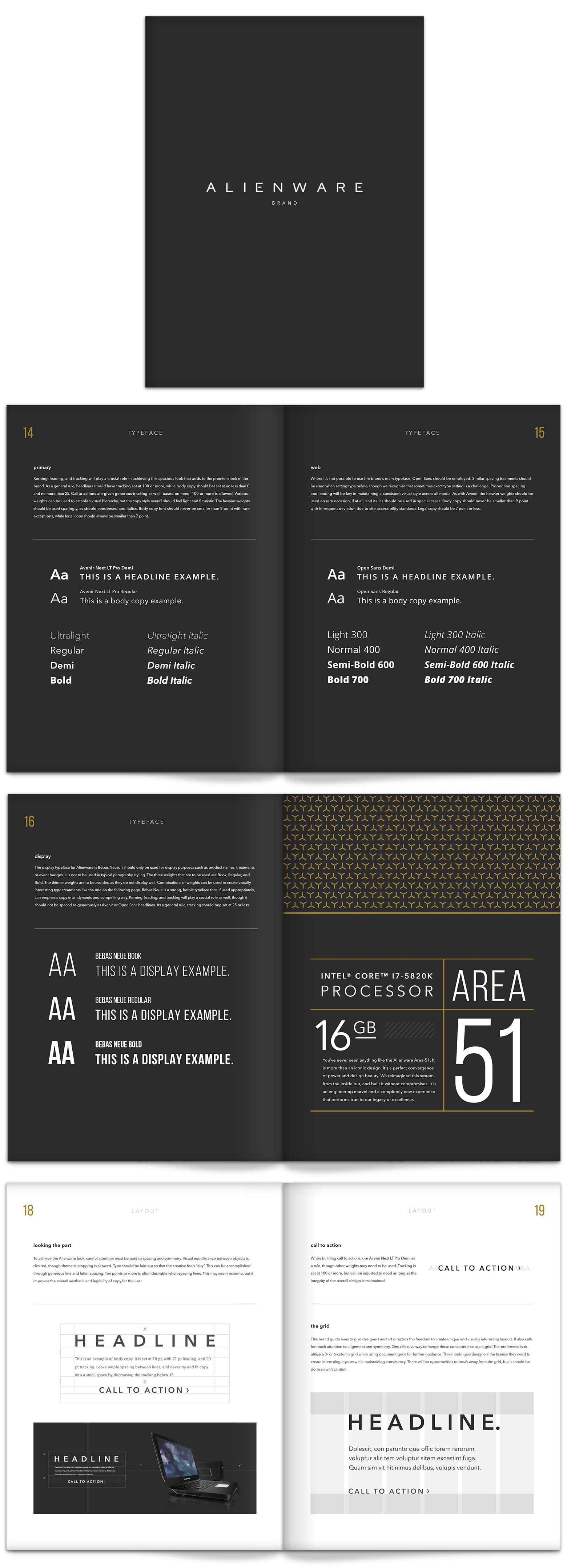
Alienware
Alienware is a brand owned by Dell computers and used exclusively for their gaming machines. Alienware uses Avenir Next LT. You can find the Alienware brand guideline on Issuu.
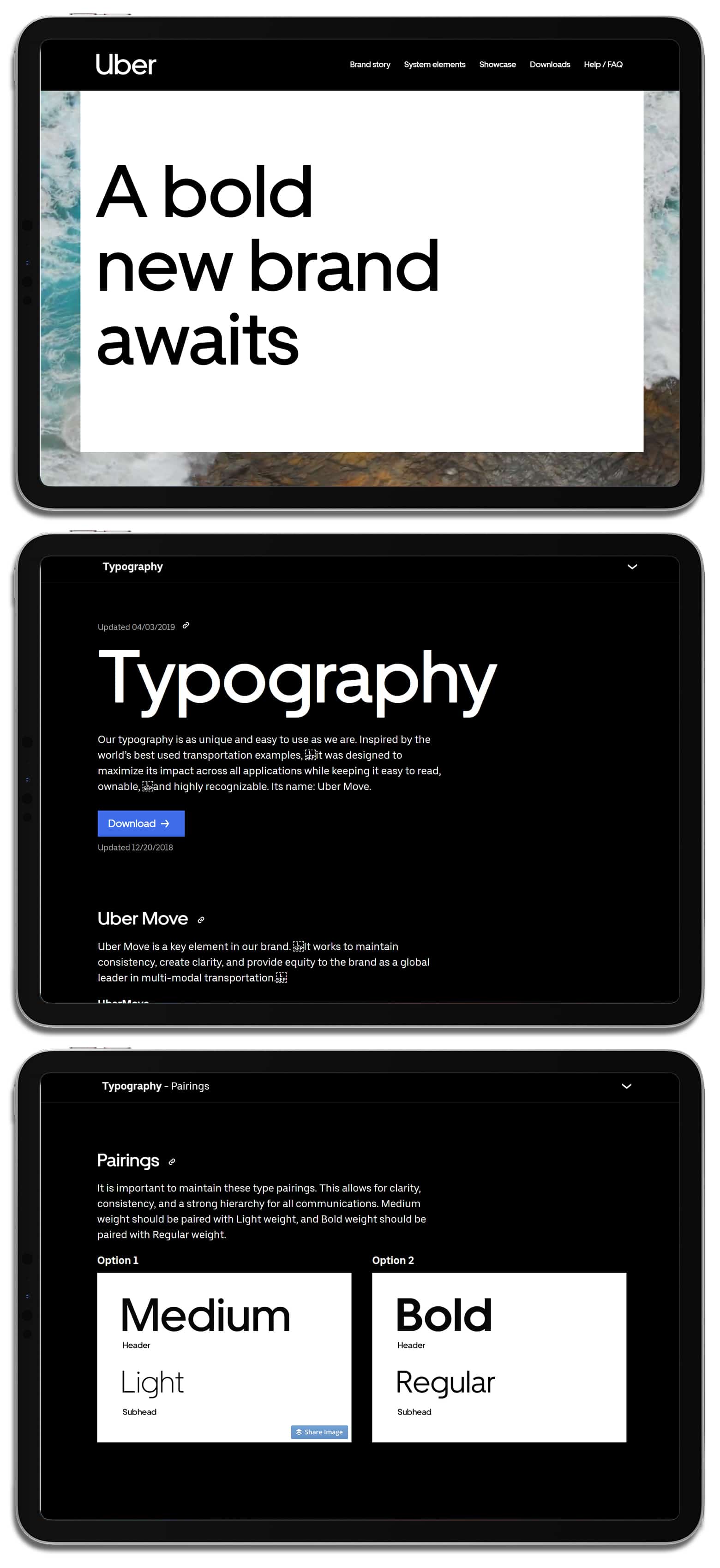
Uber
We now have a choice in how to get around town thanks to Uber, but there is only one choice for their fonts. Uber uses its proprietary font called Uber Move.
Moen
Moen is an international brand bringing aesthetically pleasing and functional taps and shower heads to the world. Moen’s font is Din Pro. Their brand specifications can be found here.

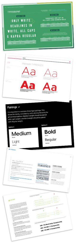
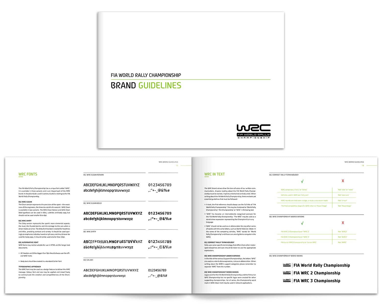
WRC World Rally Championship
Rally racing is the most undervalued sport on the planet. The racing is exciting, skillful, and dramatic and the WRC wants their brand to be too. WRC uses a proprietary font called WRC Clean and WRC Dirty, and they also use Calibri. You can find the WRC brand guideline here.
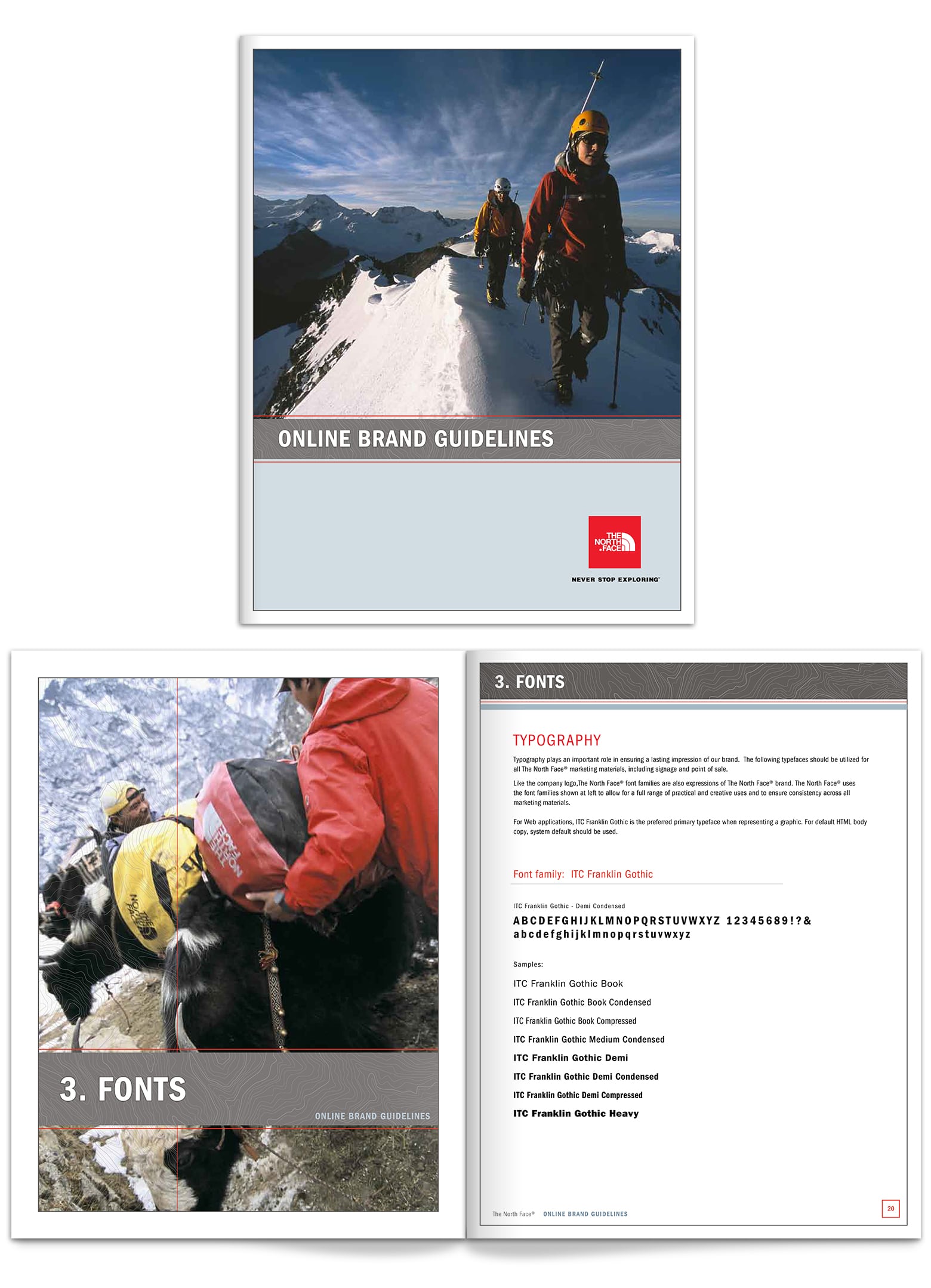
The North Face
The North Face makes quality outdoor gear to keep you warm and dry. I sought out the brand standards for The North Face because it is very similar to our project lifestyle brand: Nordeau. The North Face uses the font ITC Franklin Gothic. You can find the North Face brand guidelines on this website.
Mopar
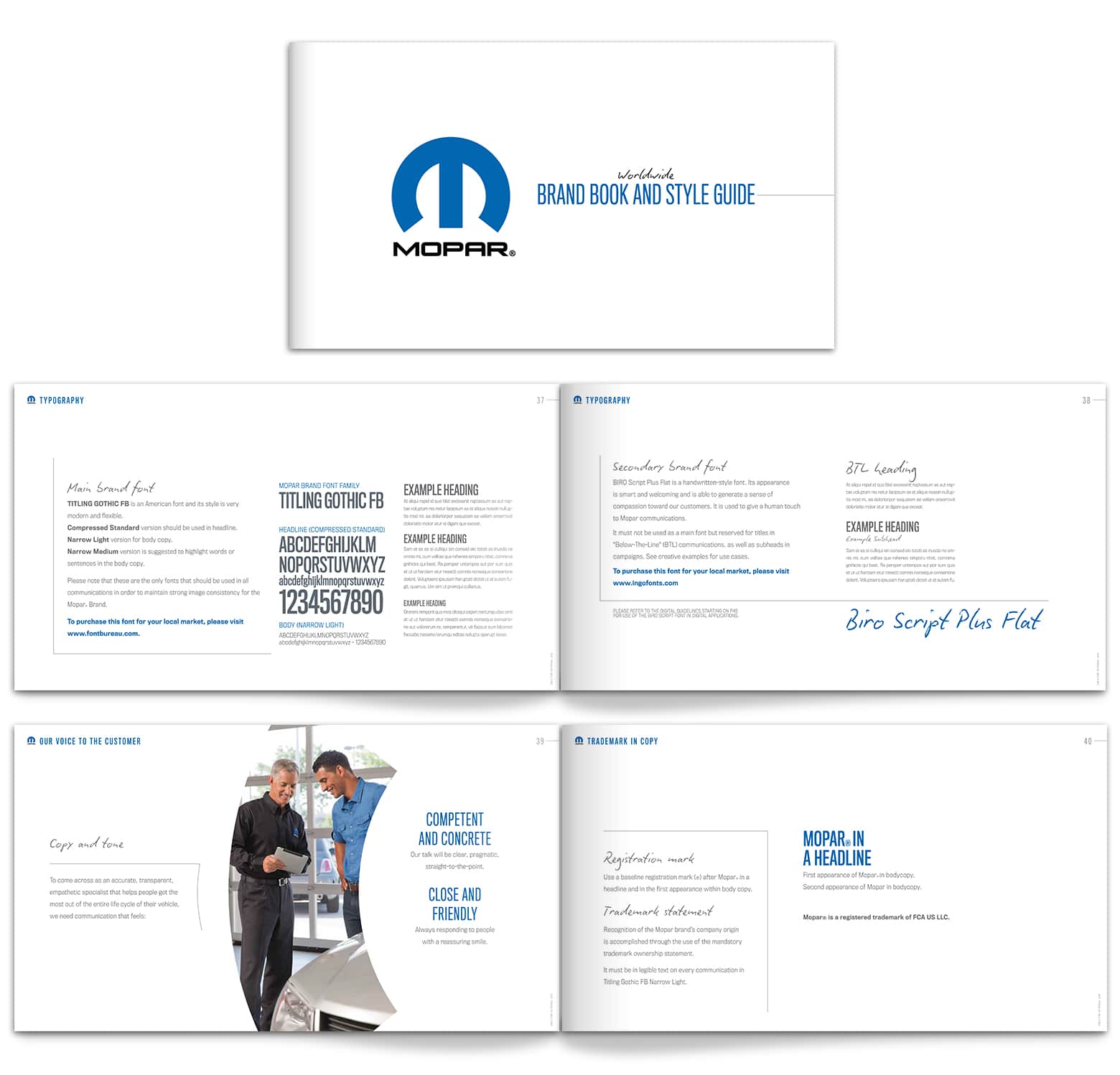
You probably don’t know about Mopar, but those who know about Mopar feel very passionately about it. They provide the OEM replacement parts for Crysler vehicles. They have a long-standing and strong reputation, particularly in the classic car community.
Mopar uses Titling Gothic FB for decorative font, Compressed Standard for headlines, and Narrow Light for body copy. The Mopar brand guide can be found here.
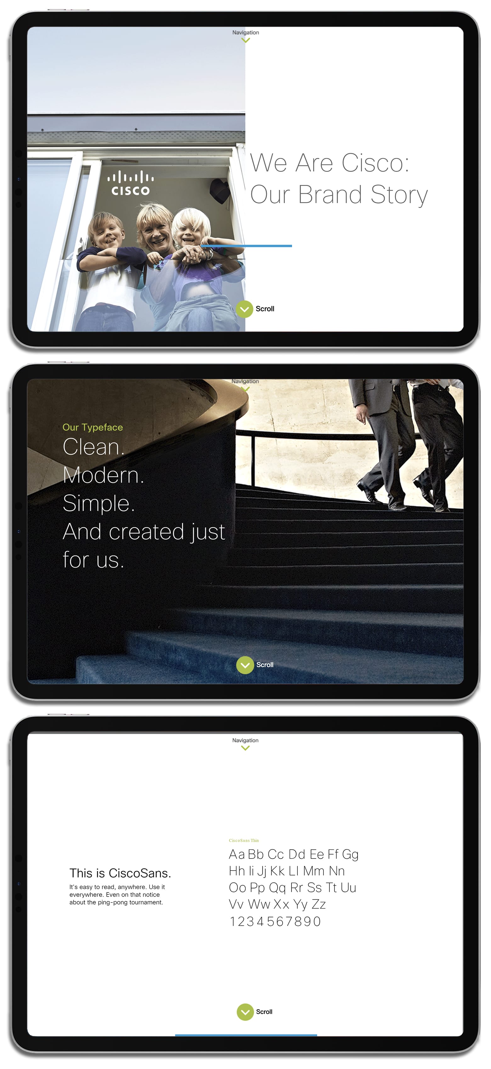
Cisco
Cisco is the other one on the list that has a microsite for their brand standards. The Cisco brand resource center not only distributes the assets but tells the story of the brand. Cisco uses its proprietary font.
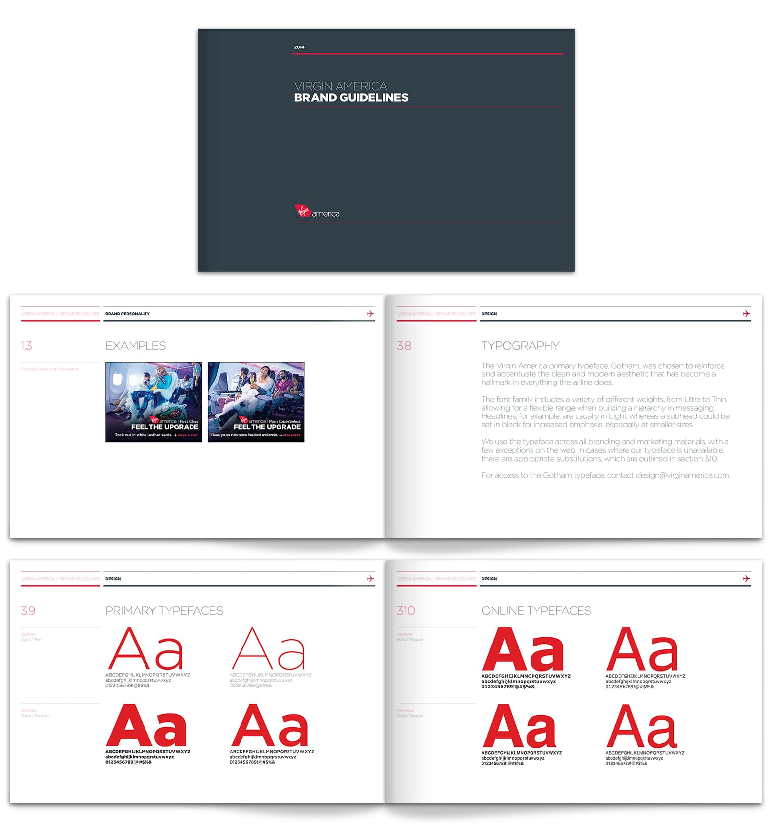
Virgin America
An airline has to top the list of information they have to communicate with their customers in text form. Getting their fonts straight is essential. Virgin America uses the font Gotham. You can find their brand standards on this web page.
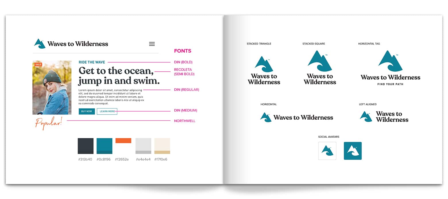
Waves To Wilderness
Friend of the blog and talented brand designer, Jacob Cass, rebranded the Wave to Wilderness lifestyle apparel brand. Jacob chose to use the fonts DIN, Recoleta Semi Bold, and Northwell. You can check out Just Creative’s portfolio piece and go through Jacob’s process for this redesign.
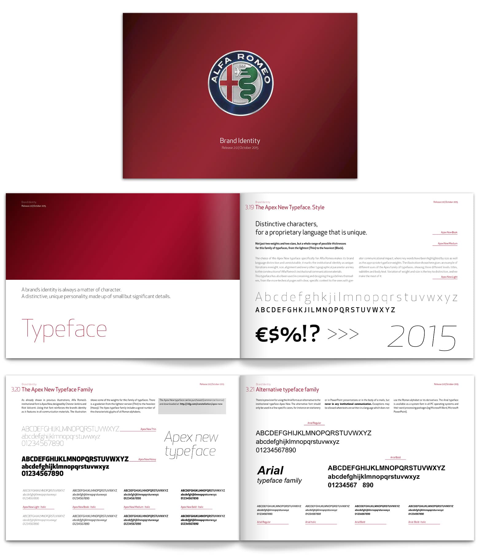
Alfa Romeo
The Italian automotive brand is known for style, so what fonts to these maven’s choose? Alfa Romeo uses Apex New, a typeface designed by Chester Jenkins and Rick Valicenti. You can find the Alfa Romeo brand standards here.
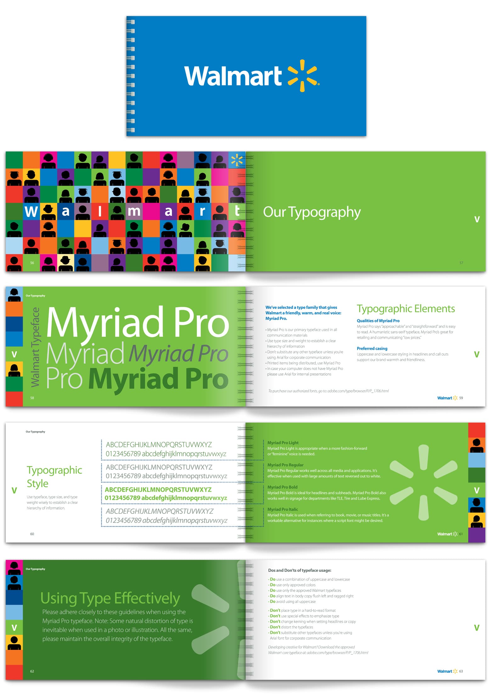
Walmart
The company that is the most ubiquitous in American’s lives also use the most ubiquitous font Myriad Pro. This is the font that is installed on every graphic designer’s machine when they install Adobe Creative Cloud. It is the default font for Photoshop, Illustrator and all Adobe’s programs. Hey, at least this makes it easy for a wide variety of vendors to use the Walmart fonts correctly. You can find their brand standards on the Walmart Brand Center.
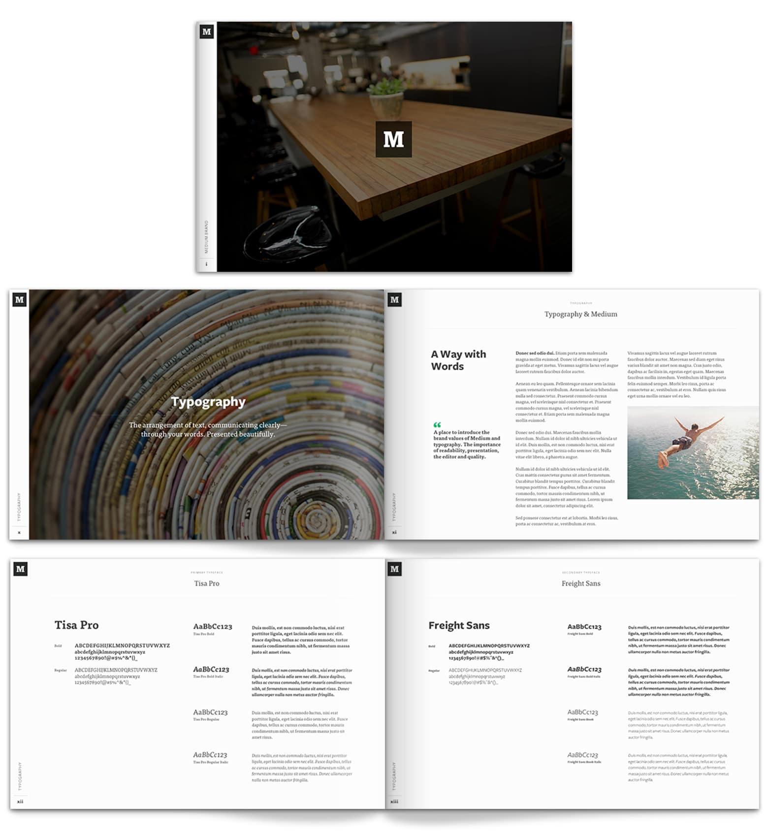
Medium
Medium is the social publishing platform that is supposed to take over the world of blogging and self-publishing. A brand all about words better have well-functioning typography. They developed their brand standards internally, and you can find their brand standards in Leigh Taylor’s portfolio.
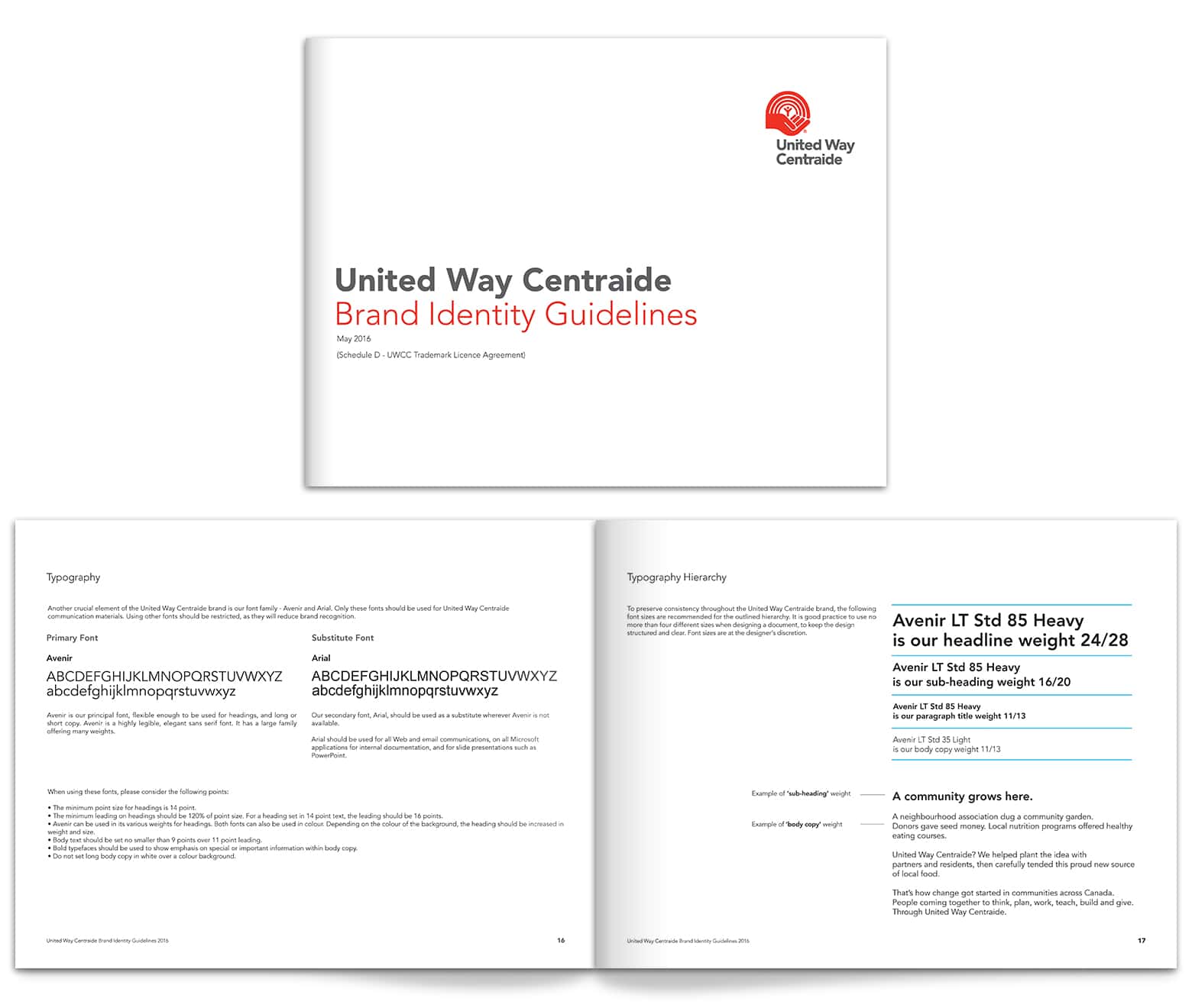
United Way
This charity that is committed to making lives better help out their designers by speccing out their fonts tightly. The United Way uses Avenir as their font (one of my favorites.) You can find the United Way brand guidelines here.
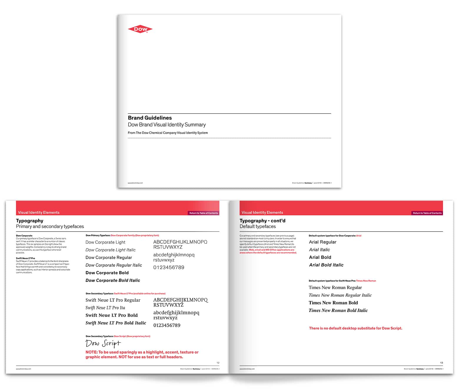
Dow Chemical Company
This company probably makes chemicals that you have unknowingly used a dozen times today. Dow has the most corporate of the brand identities we have featured here. Dow Chemical uses two proprietary fonts and Swift Neue LT. You can read their brand standards here.
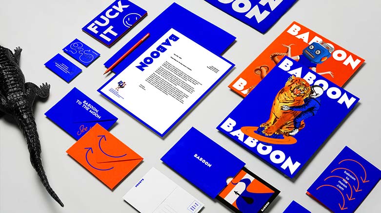
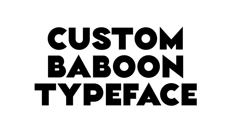
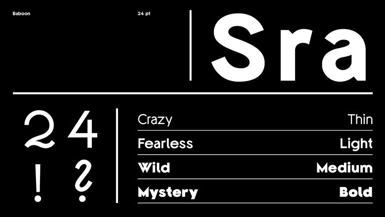
Baboon
From a very corporate example to the farthest thing away from corporate. Baboon is a bag company with a very memorable brand. Daniel Brokstad designed the brand while at the amazingly creative firm of Sagmeister & Walsh. Have your mind blown over on Daniel’s portfolio page.
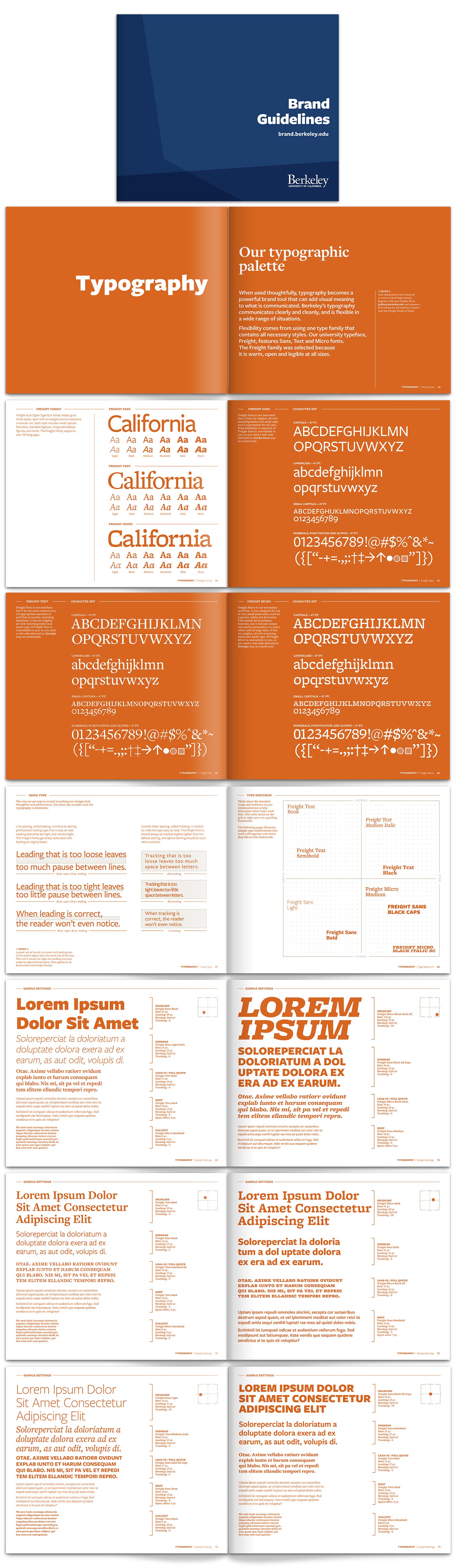
UC Berkley
The University of California Berkley is an institution full of smart people but was not sure whether to feature their work here. They have a lot of fonts and leave the designer on the other end to choose what he thinks is best for the job. This one has the most pages about type by far. I would have gone tighter but to each their own. You can read their brand standard’s here.
What did we learn about type pages in brand guides?
What are the best practices for typography pages in brand guides?
The goal of these pages is always to make it easy for designers, developers, and contractors to use the brand’s fonts consistently and correctly. In that spirit, you should consider:
Make sure there is no ambiguity
Typography pages are a specification. More akin to an engineering drawing than a magazine. There should be no confusion about what is acceptable and what is unacceptable.
UC Berkley leaves a lot of choice of fonts to the designers while Royal Carribean is quite specific and will have a more professional looking and consistent brand experience.
Show fonts in action
Showing examples of the correct font use is always helpful. It is best to show it both in multiple contexts. The use of fonts for a promotional piece, like a magazine ad, will be quite different than an informational design, like a brochure or website. It is best to show one promotional and one informational.
Alienware does a great job of seeing how designers should use fonts in context.
Say where the font is available to download
Designers will need to download the font you specify, particularly if it is an obscure typeface, custom font or proprietary lettering. Note where on the web it is available, or who they can email to have it sent to them.
The Mopar brand standards direct designers to the website Font Bureau to get their fonts.
Specify a primary font and a web font
In the years of yore, brands had to choose fonts for their websites from a very limited set that came on all computers. But now, modern browsers can download and install fonts provided by the server on the fly. But we are still in the halfway stage, where we need to acknowledge that there will need for fonts to fallback to.
Virgin America does an excellent job of specifying both the primary typefaces and online typefaces and highlighting the differences.
Headline, subhead and body fonts
Make sure you spec a the font, capitalization, kerning and line space for headlines, sub-headlines, and body copy.
Mopar specs this out very well.
Leave a Reply