A complete guide to help business owners and graphic designers develop exterior business signs that stand out.
Feature Image: Sundry Photography – stock.adobe.com
In the decade I have spent helping brands market themselves at retail, I have designed many signs for inside spaces. I understand what makes effective signage.
But recently, I had the opportunity to design an exterior sign for the first time in my career. I need to understand what I am creating, so I researched the best way to go about it was. I wanted to share that with you so that we all can design better signs.
This article outlines the steps to follow to design and develop the most effective sign possible. Within the steps, I delve into the critical considerations when creating a storefront sign.
- Determine the type of sign the business needs.
- Understand how the sign is constructed.
- Measure the space available for the sign.
- Determine the content of the sign.
- Request the brand’s font file, or pick a font.
- Layout the sign in a vector graphic design program.
- Find the most contrasting and interesting color scheme that fits with the brand.
- Render the sign on a photo or illustration of the building.
- Get the approval/sign-off of all decision-makers.
- Prepare the art for the sign maker.
- Export the design file for the sign.
I go into all steps in detail later in the article.
I also talk about why an exterior business sign is so important and how it can attract customers and grow brand awareness in the local community.
I also talk about how the best signs are customer-centric. They are simple and help people navigate to the business. In the steps, I show how to help people navigate to your business. A great sign should attract both people aware of your brand and people looking around for a company like yours.
My goal is to help you grow your brand by making the right decisions in the design of your business’ sign.
Helping Graphic Designers and Business Owners Develop Better Signs
These steps are to help both business owners and graphic designers to understand the process of developing an effective sign.
The person in charge of managing the brand will need to work with a professional graphic designer to properly create a sign. A business owner shouldn’t try to do the work of the graphic designer; when you are spending thousands of dollars on a sign, it would be foolish to save a couple of hundred bucks by trying do-it-yourself. The risk of ruining the sign and negating your investment goes way up.
Sign manufacturing and installation companies will offer graphic design services for you, sometimes for “free.” Saving hundreds of dollars of design work is a very tempting offer.
While the designers at sign shops may be quite good, the manufacturer is more interested in selling you the sign quickly than working through the process to develop a good sign. And often, sign shops will push you into design decisions that are best for their equipment rather than what’s best for your brand.
Ideally, business owners should engage a sign shop and determine what type and size of sign fit their building, budget, and timeline. The business owner should then go to a third-party graphic design to develop the sign. The graphic designer will provide the art files to the sign shop so they can construct and install the sign.
If you are looking for a graphic designer to help you develop your sign, then contact me, Colin Finkle.
How important is signage for a business?
The outdoor sign on a business is one of the best opportunities that a company has to grow its brand.
Your sign the most visible piece of marketing you will ever do for your organization. As much as 76% of people say that they have entered a business based on the sign alone.
The vast majority of a local business’s customer base live within a five-mile radius it’s the location. The sign is locals see over and over; a person living in the local neighborhood passes a business 50-60 times a month if the place is in the path of their commute.
A business’ sign can turn new residents into new customers. There are always new residents of an area looking for local businesses they may need, especially in North America. A Gallup poll found that 24% of North Americans have in the last five years from one place to another within their country.
A well-designed sign can bring in impulse shoppers. A customer may not be intending to go in a store, but stop in because they saw the sign and it reminded them that they needed something, or just wanted to go in.
The design of a sign can affect how profitable a business is over the long term. Most companies have poorly designed signs that can drag down their business. It is crucial to go through the process to get the design to work for the business.
The steps to design a sign for a business:
1) Determine the type of sign the business needs.
The first consideration for a business’ sign is where it will go. It may seem like a silly question at first, but there are some options regarding the placement to consider.
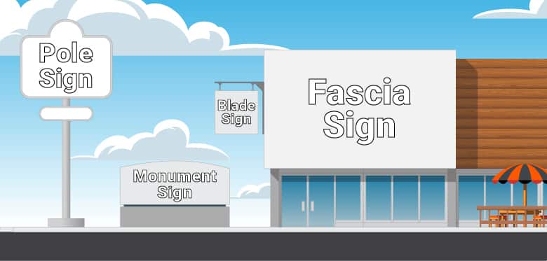
Types of exterior business signs include:
- Fascia signs
- Blade signs
- Monument signs
- Pylon signs
- Pole signs
- Awning signs
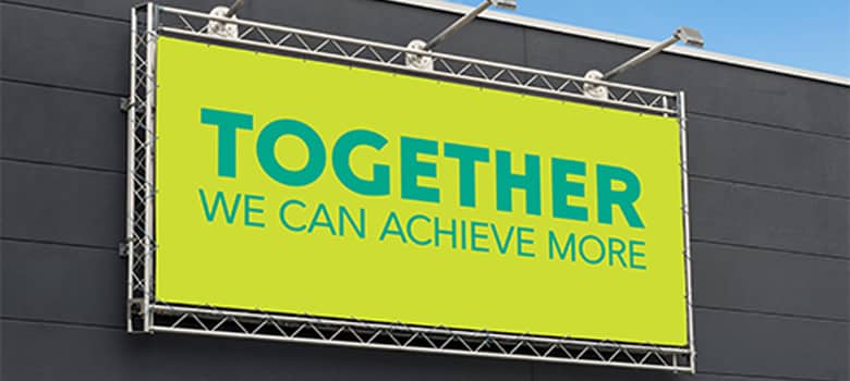
Fascia signs are the most common type of sign. They are the boxes or letters attached to the front of a building above the door.

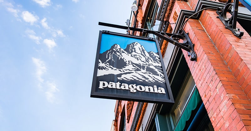
Blade signs are attached to buildings but are bolted or hung perpendicular to the face of the building. Mounting the sign sideways allows it to be seen more easily by people walking down the street. Starbucks uses blade signs quite a bit.

Monument signs are not mounded on the building. Instead, monument signs are built up from the ground close to and perpendicular to the road. Sometimes they have flowers around them. Monument signs are typically found in front of industrial buildings, which are more set back from the street then retail buildings.
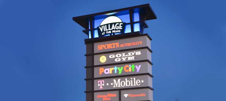
Pylon signs are one tower that has many businesses’ logos up and down them. Every business gets a small, backlit rectangle. This is typical of strip malls, plazas, and shopping centers.

Pole signs are, as their name would suggest, signs on the top of a big pole in the ground. These are typical of fast-food restaurants and businesses beside busy roads and highways.

Awning signs are printed fabric stretched over a metal frame. Awning signs have the dual purpose of protecting the entrance and windows from the rain, as well as being the buildings sign. Usually they are lit from above with spotlights.
The graphics designer needs to know what type of sign it will be because there are design considerations for each.
For example, the designer needs to know if they are designing a pole sign because they will be responsible for determining the shape of the sign and making sure the design has enough contrast to be readable against the bright, daylight sky.
The type of sign may already be determined. If the business’ space is leased, then the landlord may determine the kind of sign they want on their building. There may be one on the building already.
2) Understand how the sign is constructed.
Both the designer and the business owner should talk to the sign manufacturer to understand how the sign is constructed. There will be design considerations that depend on which method the sign shop is going with. A conversation with the sign manufacturer will help you understand what you can and cannot do when designing a specific type of sign.
The types of construction are:
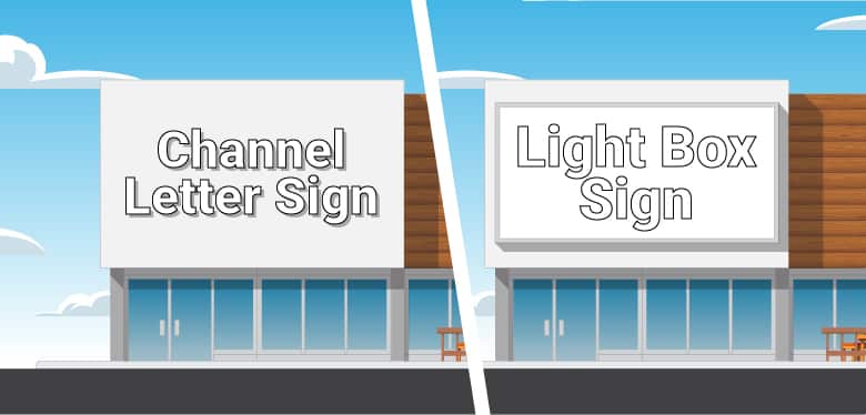
- Lightbox signs
- Cut letter signs
- Laser-cut signs
- Channel letter signs
- Digital signs
- Neon signs
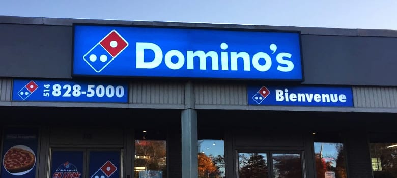
Lightbox signs are the most common type of business sign. These are preconstructed and installed boxes with lightbulbs inside. The graphics are printed on an individual sheet of white plastic called sign white acrylic. The graphic layer is installed on the front of the box.
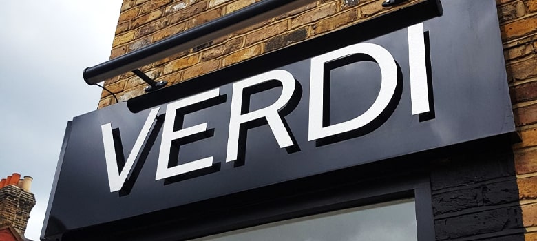
Cut letter signs are individual letters and shapes cut and mounted on a wall or backing. The letters can be cut out of wood, plastic, foam, and many other substrates. Cut letter signs do not glow.

Laser-cut signs are similar to cut letter signs in that they are computer cut shapes but are made out of metal. A laser or a plasma cutter guided by a computer-controlled arm melts away a line and cuts out an entire shape. The laser cutting process leaves no burr or sharp edge. The metal can be left raw, finished with a clear coat to keep from oxidizing, or powder-coated for durability.
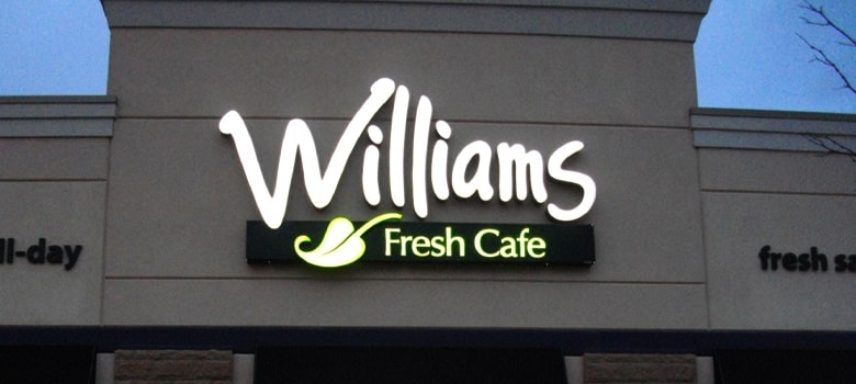
Channel letters are individual letters and shapes that are 3D and form discrete lightboxes. The back of the shapes is a sheet of aluminum with computer cut channels. The aluminum walls of the shapes are slid through the channels. The fronts of the shapes are colored translucent plastic. Lights are placed inside to make the shapes glow at night.

Digital signs are essentially TV screens. They are made particularly bright and long-lasting. Usually, digital signs are on the inside of the building and shine out through the front windows, so they don’t have to withstand the elements.
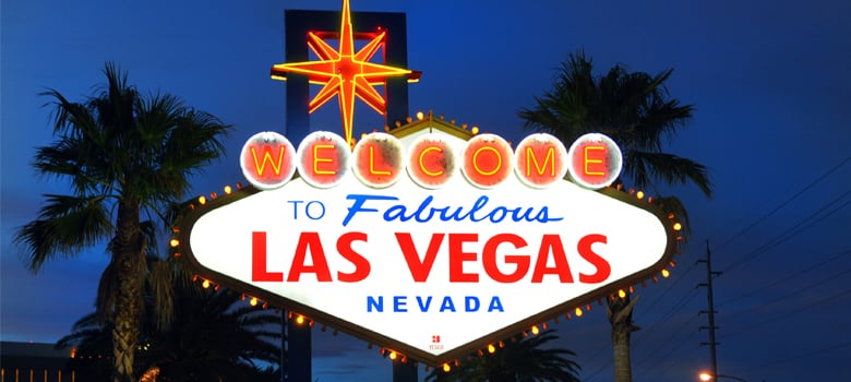
Neon signs are glass tubes with neon and other gases that glow with different colors when an electrical current is running through them. These signs were prevalent a few decades ago, but have gone out of fashion (unless you are in Las Vegas!)
Municipal governments sometimes restrict what type of signs can be put up in certain areas. For example, New York City makes it illegal for businesses to put up lit signs in residential zones. No one wants a neon sign glowing into their bedroom!
They may require that the graphic designer provide files in different ways depending on how the sign is constructed. For example, cut letter signs will require a DXF file, while backlit signs will require a CMYK PDF or AI file. A digital signage board will require a raster file like a JPG or TIFF, or even a video file like an MP4.
3) Measure the space available for the sign.
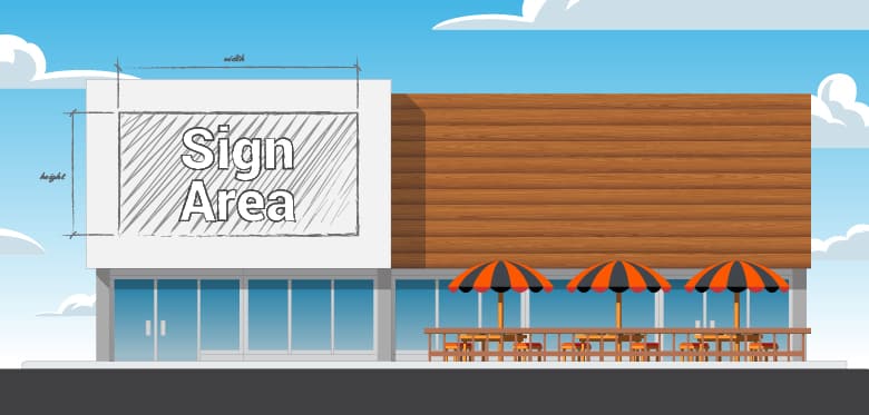
The graphic designer needs to know the size of the sign he or she is designing.
For lightbox or digital signs, the artwork will need to be designed to the exact size that is specced out. However, cut letters, channel letters, or neon signs don’t need to be made precisely to the size available, but the designer needs to know the maximum width and height they can design within.
If the business owner is already working with a sign manufacturer and installer, then that company should have done a site survey and give the designer a recommendation for the size of the sign. If no one has engaged a manufacturer yet, then the designer may need to go and measure the space for the sign.
Most of the time, this dimension will be in feet or meters. If the sign is a digital signage board, then the dimensions will be in pixels; this will be in the specifications of the sign from the manufacturer.
4) Determine the content of the sign.
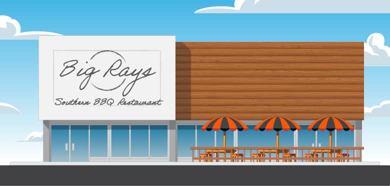
The business owner and the graphic designer need to agree on what content needs to go on the sign. Any copy for the sign needs to be written ahead of time.
In the vast majority of cases, the content of a sign should only include a) the brand’s logo, and b) a line with a few words describing what type of business it is.
Exterior business signs need to keep to the KISS law: Keep It Simple, Stupid!
The function of a sign is to help people navigate to a business. Any superfluous copy or styling will get in the way of the sign’s purpose. If the sign is visually complicated, then passers-by will not acknowledge it. Our brain filters out visual noise so we can focus on what we are looking for, and a complicated sign may be considered visual noise.
Business owners: respect the fact that people are in a hurry or distracted. They want to get to where they are going and do what they need to do. A complicated sign can make it harder to find the business they are looking for. A simple sign can help them get where they need to go, which could be your business.
In the future, one in four people in North America and Europe will be over the age of 65, and places like Italy, Portugal, Finland, Germany and Greece are already there according to data from the world bank. People with older eyes will struggle to see an overly complicated sign.
a) The Brand’s Logo
Hopefully, the logo has already been designed, but often purchasing a sign prompts a new business to design their logo. If you are developing a logo from scratch, BMB had guidance about what makes an excellent logo.
If the logo has been developed, it will need to be provided to the graphic designer in either an AI, EPS, or PDF file format. These are files for vector art. The sign manufacturer will require the artwork to be a vector format for production. Rasterized formats like JPEGs, PNGs, GIFs, and PSDs are not sufficient for signage.
Sometimes you have a logo, but it does not fit well within the proportions of the sign. The graphic designer may need to adapt the logo into a horizontal style.
b) Business Description
Leaving out a description of the business is the most common mistake businesses make when purchasing their signs.
A business description can help people navigate to your location, and thus drive traffic.
An exterior sign with only the business logo or brand name helps people navigate to the business… assuming they know the brand! But a sign without a description is not helpful for people looking for that type of business.
For example, a person may be hungry and looking for a restaurant; they may pass over the business if it is not clear to them that it is a restaurant. A helpful business description will make it clear that it is a dine-in restaurant.
If someone was looking for your type of business, what would they be looking for? What would they type in Google maps? What would they ask Siri or Alexa for?
For example, an Italian restaurant should label their building as an “Italian Restaurant,” and resist the urge to do something fanciful like “Gourmet Italian Cuisine and Tuscan Dining Room.” There is nothing wrong with framing an experience like that in a TV ad or brochure, but your sign about navigation not framing. No one will be looking for a phrase like that when they are trying to find a place to eat.
If your business description is within your name, then you can leave it off. For example, if a business’ brand name is “McKay Family Dentistry,” then adding a description line would be redundant.
Note that BMB does do not recommend descriptive brand names. Learn about the seven types of brand names.
You should leave off any information other than the logo/brand name and the business description. Your windows can be a better place to present more detailed information. Windows can communicate accepted payment type, hours of operations, brands you carry, etc. People stand in front of windows and read if they are already lured in by the overhead or ground-mounted sign; it is a different context.
5) Request the brand’s font file, or pick a font.
The sign requires a well, legible font to write out the business description with. This font should work with the overall brand identity of the business, as well.
Either the font will be pre-chosen, or the graphic designer in charge of the sign will have to pick a font.
If the font is pre-chosen, then it will be in the brand standards guide corresponding to the brand on the sign. Brand standards guides are documents (usually PDFs) from the brand design firm that outline all visual aspects of the brand to make them consistent. If the brand was professionally designed, then the business owner or brand manager should have this document.
We have an article with examples of the typography pages from 17 top brands. The font page of the brand manual should look like one of those.
If the graphic designer is in charge of picking the font, then they need to pick one that is legible. The font should not be overly stylized; script or handwritten fonts are not useful for a business description on a sign. The purpose of the sign is to help people navigate, and a hard to read font will make it more challenging.
6) Layout the sign in a vector graphic design program.
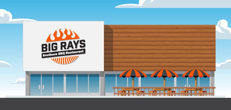
The sign needs to be designed in a graphic design program based on vector graphics. Adobe Illustrator is the standard, but the free alternative, Inkscape, can be used in a pinch.
Vector graphics are essential for exterior business signs because of the scale of the artwork. The art will keep its sharpness when you expand vector graphics to the size of a sign, where raster graphics will break down into visible pixels.
Raster graphic design programs like Adobe Photoshop and GIMP are not meant for designing signs. While the newest versions of these programs can export vector paths, they are not ideal. Working in these programs will create unnecessary work for the graphic designer and sign maker.
When creating signs that feature channel letters or cut letters, vector art is required for the shapes of these pieces. The lines in vector art will become the paths the cutting tools follow to cut out the contours of the sign. Sign manufacturers will transfer the shapes into their CAD / CAM software and program the cutting machines directly with the vector paths. Raster art means nothing to these machines.
You will use CMYK for the color space for most types of signs. Digital signage will require you to use an RGB color space. You may have to work at a 50% scale because some programs, like Adobe Illustrator, have hard limits to how big the workspace can be, and the sign dimensions can sometimes exceed them.
The logo should take up approximately 70% of the space in the sign, and the description of the business should take the remaining 30%. The logo should be above the business description. If that is not possible, the logo should be to the left of the business description.
The scale of the elements of the sign depends on how far away the sign needs to be read from. The longer distance the sign is viewed from, the larger the letters will be. For example, pole signs need much larger elements because of the longer length the viewers have to look at the sign.
The rule is: to add 1″ to the height of the letters for every 10 ft the viewer is from the sign. For example, if the sign is read from 30 ft away, then 3-inch tall letters will be the smallest readable letters.
| Viewing Distance | Min. Letter Height | Min. Font Size |
| 20 ft | 2″ | 144 pt |
| 30 ft | 3″ | 216 pt |
| 40 ft | 4″ | 288 pt |
| 50 ft | 5″ | 360 pt |
| 60 ft | 6″ | 435 pt |
| 80 ft | 8″ | 576 pt |
| 100 ft | 10″ | 720 pt |
| 150 ft | 15″ | 1080 pt |
| 200 ft | 20″ | 1440 pt |
7) Find the most contrasting and interesting color scheme that fits with the brand.
People often ask: what are the best colors for signs? The answer is that many possible color combinations will work well. The graphic designer needs to keep three things in mind.
There are three considerations when choosing colors for a sign.
- Contrast
- Intrigue
- Brand identity
Contrast is the difference in color and tone between the letters and the background color. For a sign, you want to have that difference be as significant as possible.
A stark contrast between the letters and shapes of the signs and the background will make it the most visible in all lighting conditions. It is hard to read words that have a color and tone similar to the background color and tone, especially from a distance and in dim light.
If the sign is lit up at night, then the graphic designer will need to consider what the sign will look like when the light from the environment is low, and the elements are lit up.
The most contrasting color combination is white on black, but that isn’t always possible, given other considerations. You usually want to pick a light color with a dark background. It helps to choose contrasting colors, meaning colors that are opposite each other on the color wheel — for example, bright orange on a navy orange background.
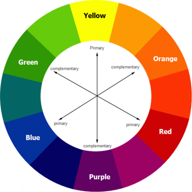
Contrasting colors on the color wheel.Credit: Web Design Ledge for the graphic.
Contrasting colors are not clashing colors. The colors should be different, but look good together. A talented graphic designer will know what colors work together without clashing.
Intrigue is how striking the colors are together. The colors a designer chooses for a sign, or a brand more generally, should be engaging while pleasing to the eye.
What colors are intriguing to have a lot to do with the local culture. I color combination loses intrigue if it is commonly used, especially neighboring businesses and competitors. Choose a color scheme that sets the brand apart.
Brand identity is the last consideration we are talking about, but certainly not the least important.
The graphic designer needs to choose colors for the sign that fits with the branding of the business. The business owner or brand manager has a brand image they are trying to convey to their customers. Some want their business perceived as professional, while others want their brands to be fun. The colors of the sign need to help the company be viewed in the way the business owner or brand manager would like it to.
8) Render the sign on a photo or illustration of the building.
A helpful step is to render the sign on a picture of the building as realistically as possible. A photo-real rendering will help the graphic designer communicate how they imagine the sign to look like in real life.
Seeing is believing for clients. Sometimes business owners have a hard time imagine what they are purchasing when they are buying a sign for their building. It’s not hard for most graphic designers to imagine what it would look like, so it is easy for them to underestimate other people’s ability to picture what they have in mind. A rendering will close the gap between what’s in the designer’s mind and what is in the client’s mind.
To render the sign, first, take a picture of the building. Second, load the image into a raster graphic design program; the industry standard is Adobe Photoshop, but GIMP or Inkscape will do the job. Third, place the vector art onto the photo, matching the perspective and scale as close as possible. Lastly, use layer effects and 3D extrusion to approximate the construction of the sign. Then send the rendering as a Jpg to the client.
9) Get the approval/sign-off of all decision-makers.
The graphic designer will have sent a flat mock-up of the sign and rendering of a sign. Everyone who has a stake in the sign will need to see those two visuals and sign off (no pun intended!) on the design.
The worst-case scenario is that the sign is constructed, and there is something about it that a decision-maker takes issue with. The sign then needs to be rebuilt at great expense, and the process is delayed. The only way of avoiding this is to get the unambiguous approval of all people who have a say.
The graphic design needs to get the sign off of the business owner. The business owner needs to get the sign off from all other stakeholders. This could mean business partners and/or investors. If the building is leased, then the landlord may need to sign off; even if it is not a term of the lease, it is a kind gesture to show them what’s going on their building. The sign design will also need to comply with the municipal bylaws regarding signs and may need to be approved.
If any stakeholder has any legitimate criticism or spots outright errors, then correct the sign design and show them again.
If they want changes just based on their taste, then push through and tell them all the reasons the design is the way it is. The approval process should not become “design by committee;” trying to hit the sweet spot between everyone’s taste is a sure way to create a vanilla, bland sign that attracts no extra customers.
10) Prepare the art for the sign maker.
Now that the graphic designer knows that the design is final, he or she can prepare the files for production.
Here are some things to do to prepare the file:
- Sort the shapes into layers.
- Name the laters appropriately (e.g., “Cut Letters” and “Backboard.”)
- Outline the font of all text objects.
- Merge any overlapping shapes of the same color.
- Set the colors to spot colors.
- Name the spot colors the names of the materials for the sign (e.g., “Black Gloss Plastic”)
- Add a layer of notes with anything that needs to be communicated with the sign maker (e.g., what elements are backlit.”
- Note the scale if you had to work on a smaller scale.
11) Export the design file for the sign.
The sign manufacturer will need the graphic designer’s art in a specific format to help manufacture the sign.
Note that the graphic design files are communication tools but are no substitute for conversation; the graphic designer must communicate all design decisions to the sign maker.
Always err on the side of too much communication, and make sure the sign maker understands what is required. Share all the visuals used in the sign-off stage (step 9) with the sign maker, so they know what is expected by the client. Talk to the production people at the sign manufacturer to make sure they understand and are not making any assumptions.
For channel letters, cut letters, laser-cut signs, or neon signs, the graphic designer will need to send the sign manufacturer:
- An AI file (If the work was done in Adobe Illustrator) or a print-quality PDF.
- A low-resolution PDF file with notes.
- A DXF file.
- The rendering of the sign on the building.
For lightbox signs, the graphic designer will need to send the sign manufacturer:
- A print-quality PDF file.
- The rendering of the sign on the building.
For digital signs, the graphic design will need to send the sign installer:
- A TIFF in the RGB color space for a static sign.
- A high bitrate MP4 for an animated sign.
12) Send the design files to the manufacturer.
The graphic designer will need to take the package of files and send them to the sign manufacturer.
All the art should be vector, and one of the benefits of vector art is its minimal file size. Full resolution files may be able to be sent through email. If the files are too big for email, then the graphic designer will use a large file transfer service like WeTransfet, Google Drive, Dropbox, or Box.
The sign manufacturer should inspect the files and let the team know if anything further is required.
Many times, design decisions will affect the cost of the sign. The sign maker may need to update their quote based on the size, colors, and techniques specced out by the graphic designer.
Hopefully, everything is good, and the sign manufacture can start making the sign and schedule a time to install it on the building.
Conclusion. What makes an exterior business sign good? Making the sign customer-centric.
The overarching rule of designing a sign for a business is: be customer-centric. Your helping a customer find your business, and everything about your sign should facilitate that. It should be easy to read and viewable from a distance.
You should not selfishly try to pump a ton of marketing into the eyes of the people passing by. People will write it off as desperate, and keep on walking or driving by. They may not even notice, because their brains may filter a busy sign out as visual noise.
A classy, readable, proud sign that fit the brand of the business while helping customers navigate will return the best results. And signs are expensive, so you want a return on that investment.
Leave a Reply